
Color has a place in every visual a company creates. From logos and branding to billboards and social media ads, color impacts how the audience views and perceives the company as a whole. Color has the power to inform, attract attention, engage an audience, create a visual experience, and can even increase memory.
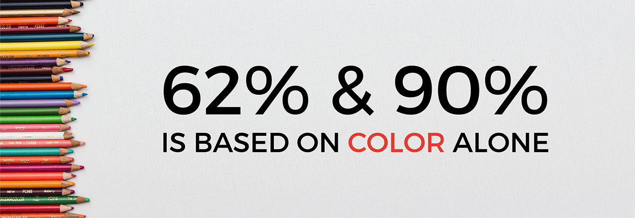
The Institute for Color Research conducted a study that revealed people make a subconscious judgment about a person, environment, or product within 90 seconds of initial viewing and that between 62% and 90% of that assessment is based on color alone.(1)
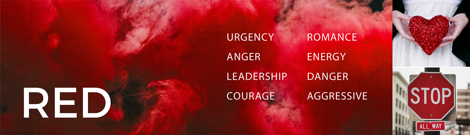
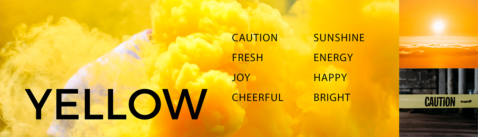
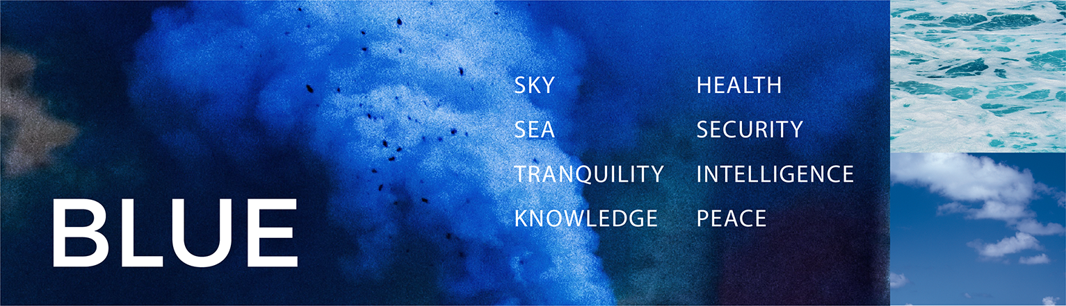
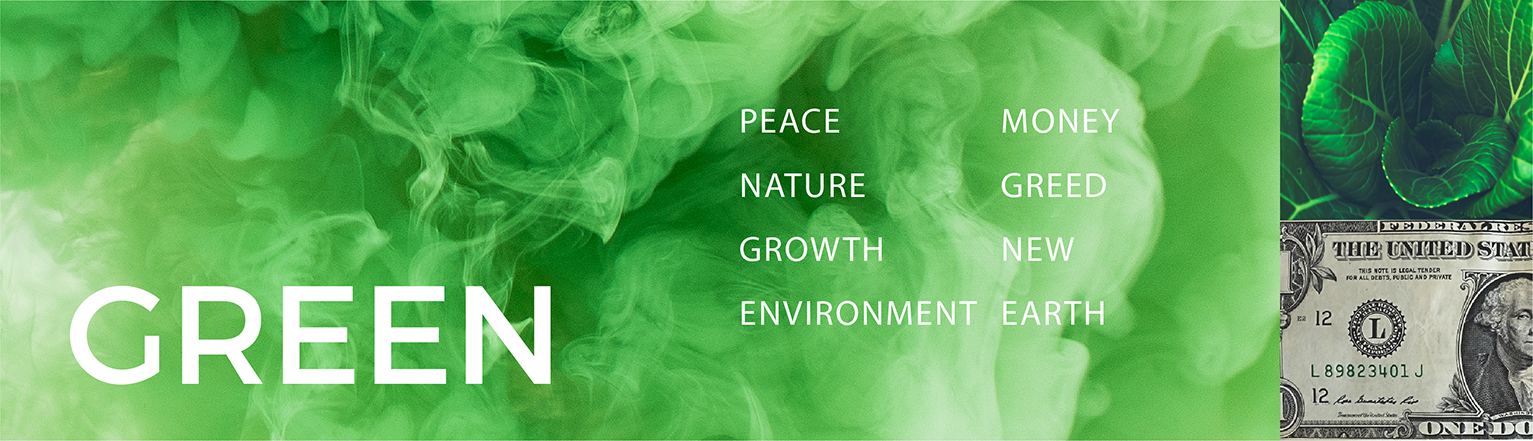
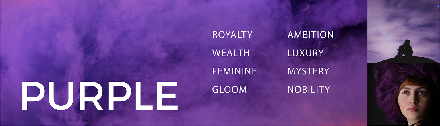
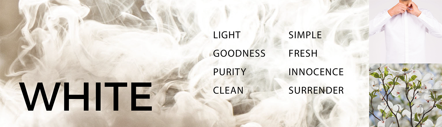
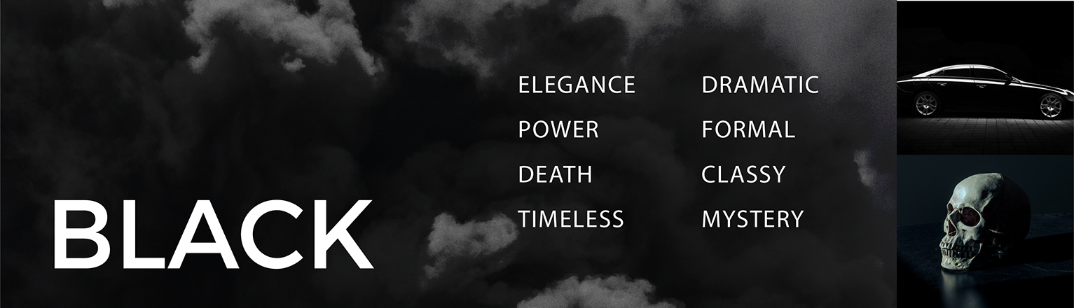
Color has the ability to communicate a feeling or idea immediately. Thus choosing the right color for the job is very important. Different colors display different ideas or emotions. These emotions can vary person to person, but for the majority of the population, those associations are very similar. Below is a list of colors and the most common emotional associations.

Color is extremely important when it comes to a company's brand. For example, color increases brand recognition by up to 80 percent.(2) Due to the close associations color and emotion have, choosing the right color can tell more about your company quicker than words or even icons.
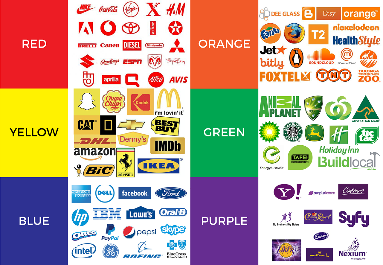
- 1 in 3 top global brands use the color red in their logo
- 80% of consumers recognize Starbucks just from its green color
- 91% of consumers recognized at least one brand from color alone
- 92% believe color presents an image of impressive quality
- 83% believe color makes them appear more successful
- 81% think color gives them a competitive edge
- 76% believe that the use of color makes their business appear larger to clients (3)
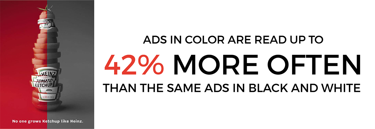
Color can engage an audience and increases participation with a brand or an ad. Colors naturally draw the eye. Because color evokes emotions, they assist graphics in making people care or feel a certain way. Ads in color are read up to 42% more often than the same ads in black and white (as shown in a study on phone directory ads). (4) Choosing the right color for the right graphic depends on your audience and your overall goal. For example, if your graphics goal is to create a sense of urgency, the color red has been shown to encourage urgency and energy. Red is the color of stop signs, blood, fire, and many sports cars. In contrast, green is associated with the earth and plants as well as wealth and money.
Color can be a helpful tool to guide the eye through a graphic. It aids in directing focus to the most important aspects of a piece. Color, especially bright colors, naturally draw attention. Thus a designer will likely make the most important aspect of a graphic in a bright or contrasting color. For example, the ad below for McDonalds has vibrant shades of red and yellow on a dark asphalt backdrop. Similarly, the middle ad has a simple white background while the most important text is larger and blue. The use of blue also parallels the color of the ocean, something the ad is advocating to protect.

Psychologists have documented color can increase memory by adding extra markers of data. Instead of using text alone, color adds more details and dynamics or “tags” that help the brain remember information. These extra tags help us process information so we are more likely to store it than a black and white graphic. Color can improve readership by 40 percent (5), learning from 55 to 78 percent (6), and comprehension by 73 percent (7).
Knowing the general color associations and basic rules of use will help a company choose colors to more effectively market to their audience. Color provides extra information, attracting more attention from the right audience and can keep these viewers more engaged while helping them remember what they were shown.
(1) Source: CCICOLOR - Institute for Color Research
(2) Source: University of Loyola, Maryland study.
(3) Source: Conducted by Xerox Corporation and International Communications Research from February 19, 2003 to March 7, 2003, margin of error of +/- 3.1%.
(4) Source: White, Jan V., Color for Impact, Strathmoor Press, April, 1997.
(5) "Business Papers in Color. Just a Shade Better", Modern Office Technology, July 1989, Vol. 34, No. 7, pp. 98-102
(6) Embry, David, "The Persuasive Properties of Color", Marketing Communications, October 1984.
(7) Johnson, Virginia, "The Power of Color", Successful Meetings, June 1992, Vol 41, No. 7, pp. 87, 90.


