Graphic Design Services for Enterprise Brands
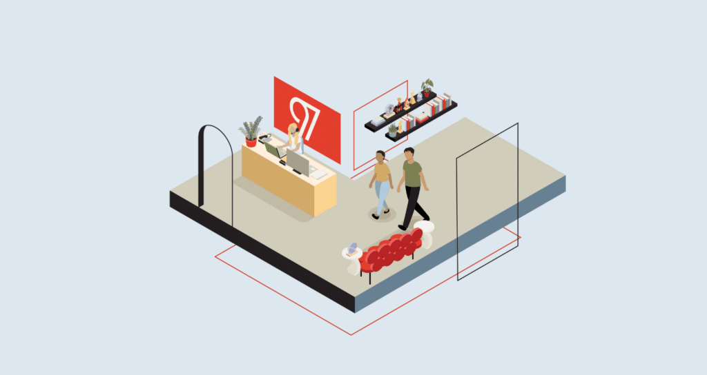
97th Floor delivers sharp, strategic designs built for impact. We create visual assets that complete campaigns and drive conversions.
Let’s Build a Proposal
As AI continues to reshape how users discover and engage with content, design must evolve too. We create visually compelling assets structured for AI-driven environments like generative search previews, chatbot interfaces, and voice-activated displays.
We transform ideas into impactful designs that leave a lasting impression, whether that's one of these designated design services or a custom design project—from packaging to speaker presentations, apparel to direct mail.
Strong brands are built on consistency and clarity. We help enterprise brands define, refine, and express their identity through logos, scalable guidelines, and visuals.
From striking landing pages that drive conversion to meticulously designed email campaigns that maximize open rates and click-throughs, our web and email designs drive results.
Good design is what turns your content into an asset. We design eBooks that are clean, branded, and conversion-optimized, turning valuable insights into tools your audience will be dying to read and share.
Motion captures attention. We create animated visuals that bring your message to life, from explainer videos to social loops to dynamic campaign assets. Every frame is built to engage, clarify, and convert.
Designing for performance means creating ads that stop the scroll and earn the click. Our team crafts ad creative that’s tailored to each platform and aligned with audience behavior, campaign goals, and brand identity.
Design isn’t siloed. Our designers collaborate directly with our SEO, content, and advertising teams to make sure the creative aligns with every strategic goal.
We do both. If you’ve got established brand guidelines, we’ll follow them closely. If not, we can help build a scalable, professional identity from the ground up.
We focus on performance: click-through rates, engagement, conversion, and brand consistency. Design is always part of a larger strategy, and we measure it accordingly.
We’re built for what your team needs, whether that be a long-term creative partner or targeted help for a specific campaign. Our work is scaled to fit your vision.
Turnaround times vary by project, but we balance speed with quality. Your dedicated team will set clear timelines up front and keep you in the loop throughout the process.
We design for strategy. Our creative work is built with data, grounded in marketing goals, and integrated into our full-funnel performance campaigns. With 97th Floor, you get years of industry experience coupled with expert creativity.
Yes. We’ve delivered successful design work across tech, SaaS, healthcare, B2B, education, and more. We tailor creative to your industry, audience, and growth goals. Check out our industries to learn more.
As AI-driven discovery tools become more common, design needs to support both human users and machine readability. We create assets with clear structure, intentional metadata, and aligned messaging that reinforces brand identity across all channels. Our visuals are built to be understood, indexed, and surfaced by AI search.