
Sans Serif vs Serif
There was a cry of outrage when Gap attempted to transition from their 20-year-old design to a fresher look back in 2010. While the brand was ready to push toward modernization, long-time customers weren’t ready to see the logo they’d known for years disappear. So, they fought to change Gap’s mind. And they won.
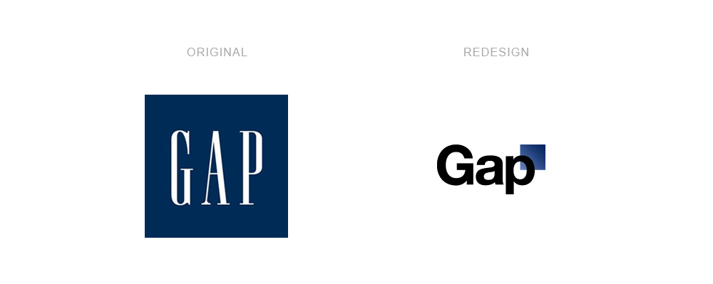
Gap ended up abandoning the logo after just one week due to extensive customer backlash. And the biggest change in their redesign that caused the whole debacle? Serif vs sans-serif font.
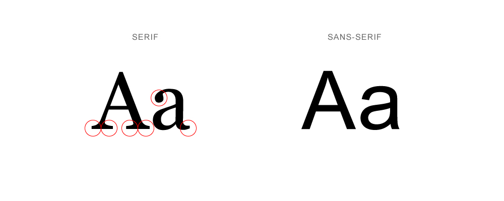
A “serif” is a decorative stroke that extends from the bar or beam of a letter in a typeface. The difference between serif and sans-serif fonts is that serif fonts have those little feet-like hooks extending from their letters, while sans-serif fonts do not.
Pros & Cons of Serif Fonts
While there are exceptions, serif fonts or typefaces are widely known for being traditional, conservative, elegant, formal, or established. Think back to our Gap example: in changing from serif to sans-serif, they wanted to position themselves as a more modern company. But die-hard customers saw them as a classic brand and wanted that elegance represented in the design of their logo.
Serif fonts have a typeface that is arguably more readable, but only in printed works. Books, newspapers and magazines most often use serif fonts for large bodies of text because serifs make letters distinctive and easy for our brain to distinguish individual letters. Historically, a serif font’s readability on a desktop, tablet or mobile phone can get a little muddy because of typical screen resolution. However, with technology like retina display and 4k screens, serif fonts are becoming more readable on the web as well.
Pros & Cons of Sans-Serif Fonts
Sans-serif fonts do not have serifs (remember those little feet-like strokes?) extending from the bars or beams of their letters. This more simple design brings different uses and connotations. While there are exceptions, sans-serif fonts are typically associated with being modern, clean, young, and friendly.
Sans-serif fonts generally have a more digitally readable typeface than serif fonts, and so are more often used for texts that will be viewed on a screen. While the complexity of serif letters can get murky on screens, sans-serif letters use a more simple design that does not. So, sans-serif fonts are often chosen for their digital readability.
So who cares?
When it comes to serif vs sans-serif, does what you choose even matter? Well, let’s take a look at some of the most popular sans-serif logos in a serif font:
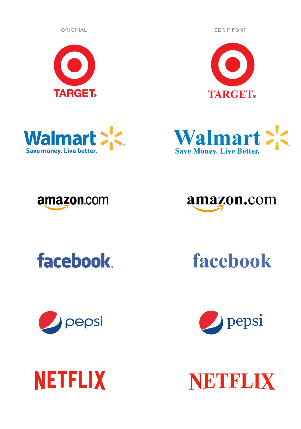
We are so used to seeing these logos sans-serif, that seeing the logo with serif fonts feels off. The text doesn’t change, but the font completely changes the look, feel, and perception of the brand. When you replace a sans-serif font that can make a brand feel young and friendly, with a serif font, the brand suddenly feels uncomfortably formal.
Think of these brands’ messaging: Target, Walmart, Netflix, etc. are all brands that rely on connecting with the general populous rather than an elite few. So, a more modern and approachable look makes sense for their brand design.
Now let’s take a look at some of the most popular serif logos, in a sans-serif font:
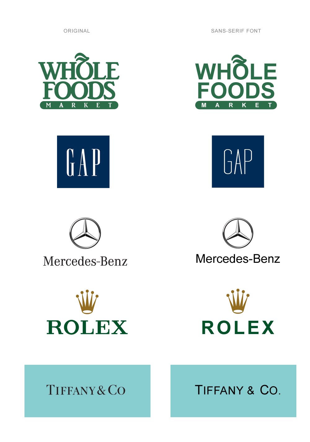
With many of these brands, it feels unnatural to have the text looking so youthful and modern. Without a serif font they no longer feel as classic or timeless, and even come off as less established. It’s as if these brands have lost maturity and elegance, just by shifting to the sans-serif font.
And, again, it makes sense. Brands like Tiffany & Co or Rolex depend on maintaining their elite status to bring in their revenue numbers. Appearing fresh and modern is not a priority, in fact, it’s counterproductive to their design goals. Their brands strive to portray that timeless, elegant, almost untouchable air, and a serif font typeface allows them to do that.
As we’ve established, fonts have a large voice when it comes to your logo or brand, and sans-serif vs serif is one aspect that can make a big impact. So how is your brand looking? Is the font evoking the right personality of your brand? Does the font support the overall look and feel of your brand? If not, it might be time for a redesign.


